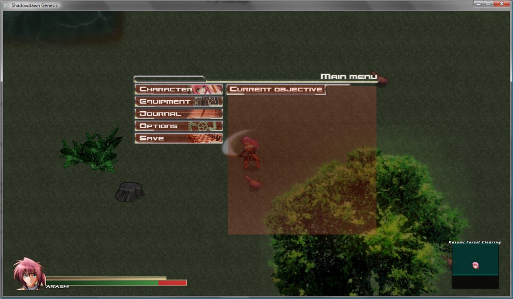
A quick update today, but I started designing the main menu and with it what other UI elements like text windows and even the old placeholder status bar should look like. I am doing my best to make this game as player friendly as possible, because above all else I want everyone to have fun and play the game the way they want to, so I figured that having a somewhat larger map display with the menu would make sense since I’m going for an overlay approach. I’m also going to put options in to use a smaller HP/status bar and adjust the mini-map to the bottom right or remove everything entirely so it’s only the map being displayed when playing the actual game.
In the process of programming the menu, I’ll finally be implementing the actual inventory and equipment system, the last real puzzle piece in the RPG genre. Since I have to program scripts for all the usable special items/skills, I’ll probably just be focusing on the only one available in the first stage, the Rune of Life, just to make sure things are working and then move on to the rest of the game. I just want to get all the coding pretty much squared away so I can work on artwork and level design.
The only thing I haven’t decided is how much the larger map should show, I may write a method to have a known map and update with Arashi’s discoveries of secret paths and whatnot as the player goes about the countryside. Dungeon areas may not even have a base map and need to be filled in by exploring, I just don’t know yet.


Why not take the Normal RPG approch on maps and make a smaller one on the main screen and have a function to bring up the larger overall map on a full screen. and also exsploring to fill it in sounds like a good idea not alot of rpgs do that anymore so should be exciting to see that take form.
I’m thinking of adding richer color to the map/mini-map, instead of going with the typical neon outline that most games use nowadays. I mean, I will probably use a bright highlight for the known borders, but also want a certain authentic look to the maps too, after reviewing some of the older games it just looked cleaner. It just doesn’t make much sense for Arashi to not be at least familiar with the common areas of northern Foxfire (the country she is being trained to protect), but then I don’t want to give away all the secret roads because that would defeat the point hehe.
I took the larger map away from the main menu as you might have noticed in the next entry, so I will probably just have a start or select/back button access to the larger map like in Star Ocean, or bring it up with the Journal Menu.